This post is all about our brand new game logo and we want to tell you a little bit about its design and composition. First of all, if you’re willing to design something, keep in mind what is your goal. We wanted to design a logo for our game about bumper cars, a fast crash derby placed all over the universe. It should represent a future look, clear contures and smashing colors. So Frece thought about everything, which represents racing and crashing cars and out it together: Chrome (ok, we’re a bit older and were socialized in the 1990, when chrome was a sign of future (see Spongebob Chromepants in the year 3000 episode). Chrosshair for aiming enemies, ultimate racing sign is a checkerbord pattern. And here, what he did:
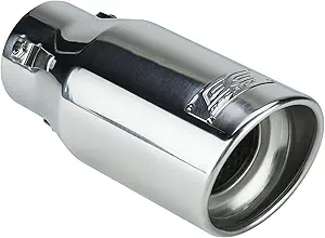
The greyish stylized frames lets you think of engines, muffles and chrome:

Additionally a chrosshair for aiming enemies is integrated:

Another thing is choosing the right color for a logo: RED in our game stands for aggression and hard smashing bumper cars.
“Red is the color of extremes. It’s the color of passionate love, seduction, violence, danger, anger, and adventure. Our prehistoric ancestors saw red as the color of fire and blood – energy and primal life forces – and most of red’s symbolism today arises from its powerful associations in the past.” (Source: Colormatters)
Some rally stripes in checkerboard pattern are a reminiscence to a race’s checkered flag.

Off topic: Image above shows Formula 1 marshal on the left accidentally waving checkered flag one lap too early – muhahaha.
Finalized is our temporary game logo with crossed screwdriver and wrench to symbolize WIP (not VIP) status of our game and it’s logo. And here it is:

No rocket science about logo design, right? But as I always tell my students: For each and every single piece, form and color in logo design, there should be a reason.
But what the hell is that yellowish thingi in the center? Well, we’ll talk about that in a later post.
More info on BumperCar game – GET BRANDED.
Greetings neverdowell